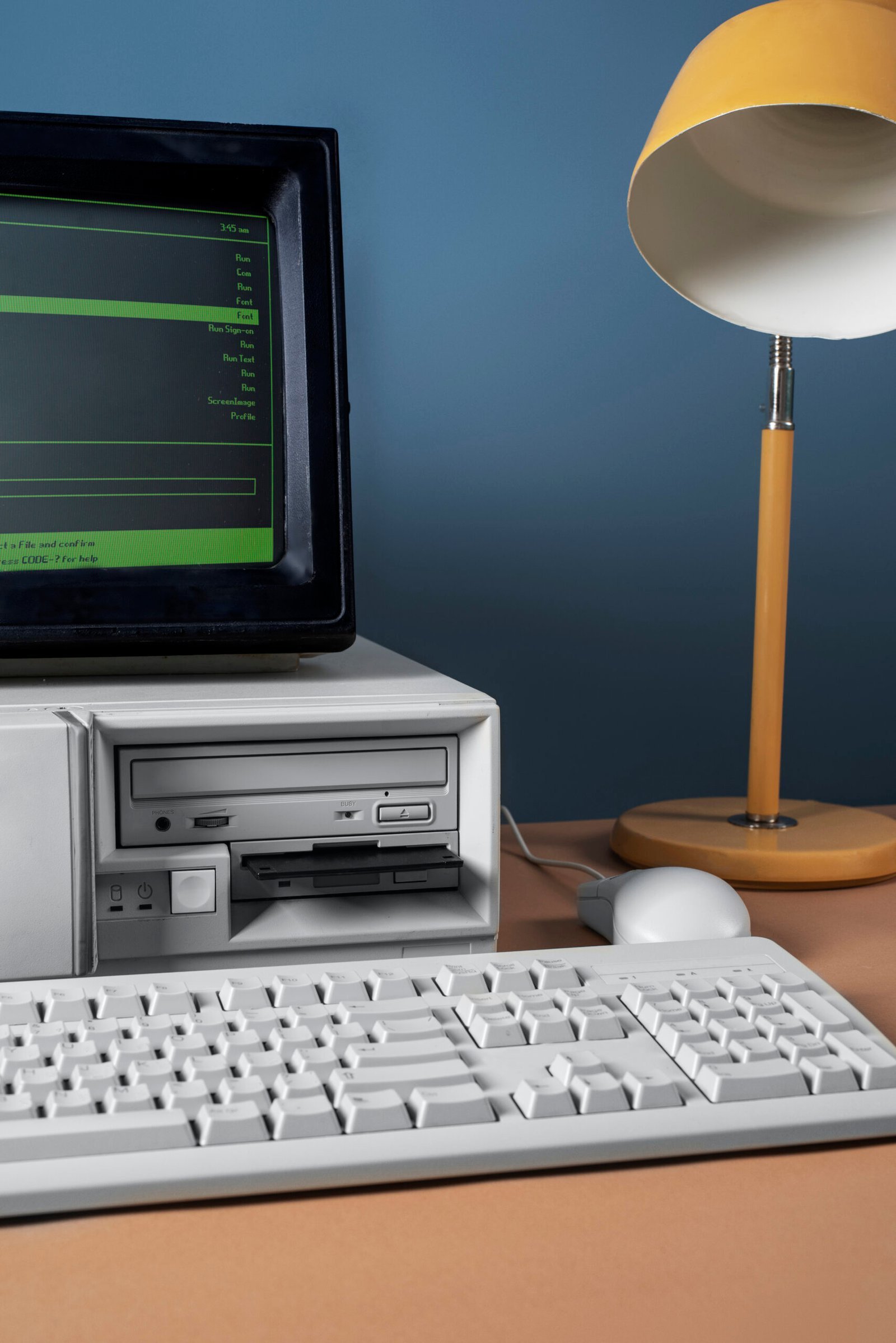
In the vast realm of the internet, where sleek design and user-friendly interfaces reign supreme, there exists a tale so baffling that it borders on the absurd. Imagine a client, brimming with entrepreneurial zeal, eagerly awaiting the launch of his cutting-edge business website, only to receive something straight out of the computing dark ages. So is the story of a client who wanted a modern website but ended up with one made from MS-DOS.
The Initial Consultation
It all started on a bright Monday morning. Mr. Johnson, a small business owner with big dreams, decided it was time to take his business online. He envisioned a website that would catapult his brand into the digital stratosphere. With visions of sleek animations and intuitive navigation dancing in his head, he set out to find the perfect web developer.
After some quick Googling, he stumbled upon a freelancer named Gary. Gary’s profile boasted of “30 years of experience in the tech industry” and “proficiency in multiple programming languages.” Mr. Johnson was impressed. “This guy must have seen it all,” he thought. Little did he know, Gary’s expertise lay predominantly in the era when floppy disks were the pinnacle of portable storage.
The Agreement
Their first meeting was over a Zoom call. Mr. Johnson, brimming with excitement, outlined his vision. “I want a website that stands out,” he declared. “Something that screams modernity and sophistication.”
Gary, nodding sagely, replied, “I understand completely. I have just the thing in mind.”
If Mr. Johnson had been more tech-savvy, he might have noticed the glint of nostalgia in Gary’s eyes—a glint that hinted at Gary’s penchant for retro technology. But alas, Mr. Johnson was more concerned with color schemes and logo placements.
They agreed on a timeline and a budget. Gary reassured Mr. Johnson that he would be working on something “truly unique.” Mr. Johnson left the meeting feeling confident that his business was in good hands.
The Development Phase
Gary, true to his word, began working on the project immediately. However, his interpretation of “modern” was somewhat skewed. He dusted off his old MS-DOS programming books, cracked his knuckles, and got to work.
For those unacquainted with MS-DOS, it stands for Microsoft Disk Operating System. It was the predominant operating system for IBM PCs in the 1980s and early 1990s. Think of it as the great-great-grandfather of Windows—a black screen where users had to type in commands to perform even the most basic tasks.
Gary’s creative process was a sight to behold. He meticulously typed out lines of code, crafting a digital experience that he believed would blow Mr. Johnson’s mind. There were no graphics, no mouse navigation—just pure, unadulterated text-based interaction. For Gary, this was a masterpiece; for the rest of the world, it was an anachronism.
The Big Reveal
The day of the grand unveiling arrived. Mr. Johnson, seated in front of his computer, could barely contain his excitement. Gary, with the enthusiasm of a child showing off a finger painting, sent over the link to the new website.
Mr. Johnson clicked on the link, expecting a cascade of modern design elements. Instead, his screen filled with a black background and a blinking cursor, awaiting his command. He stared at it, bewildered.
“Is this a joke?” he muttered to himself.
After a few moments of stunned silence, he dialed Gary’s number. “Gary, there seems to be some kind of mistake. All I see is a black screen with a blinking cursor.”
Gary, ever the optimist, replied, “Ah, yes! Isn’t it fantastic? This is a fully functional MS-DOS interface. Your customers can type in commands to navigate through your services. It’s retro-chic!”
Mr. Johnson was speechless. He had asked for a modern website and received something that belonged in a computer museum.
Customer Reactions
Determined to give Gary the benefit of the doubt, Mr. Johnson decided to show the website to a few trusted friends and customers. Their reactions ranged from confusion to outright laughter.
One friend, a millennial who had never even seen MS-DOS, asked, “Do I need to code just to buy your products?”
Another quipped, “Is this some kind of escape room challenge? Do I need to hack into the mainframe to place an order?”
The feedback was unanimous and the website was a disaster!
From DOS to D’oh!
Realizing the gravity of the situation, Mr. Johnson contacted Gary for an urgent meeting. “Gary,” he began, trying to remain calm, “this isn’t working. My customers don’t know how to use this. I need something user-friendly.”
Gary, still convinced of the brilliance of his creation, reluctantly agreed to make changes. However, it quickly became apparent that his skills were stuck in a bygone era. His attempts to modernize the site resulted in a chaotic amalgamation of outdated code and rudimentary HTML.
The Resolution
In the end, Mr. Johnson had to hire a new web developer to salvage his online presence. The new developer, well-versed in contemporary web design, created a sleek, modern website that met all of Mr. Johnson’s expectations.
As for Gary, he took the experience in stride. He realized that his love for retro technology was better suited for personal projects rather than client work. He eventually found his niche creating vintage-themed websites for enthusiasts and collectors, where his MS-DOS skills were celebrated rather than derided.
The Importance of Clear Communication
This tale of technological mismatch underscores the importance of clear communication and understanding between clients and developers. What one person considers “unique” and “innovative” might be vastly different from another’s interpretation.
So, the next time you hire someone for a tech project, make sure to clarify your expectations—and perhaps ask a few questions about their definition of “modern.” Because as Mr. Johnson learned the hard way, not all that blinks is gold. Maybe he should have acquired the help of an AI Tool?


Leave feedback about this